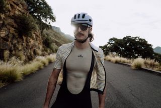
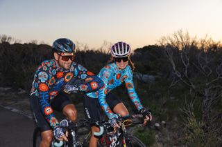
For a sport that always finds itself at the vanguard of technology, the evolution of cycling style often seems to lag a few years behind the advancements of its bikes.
Often, something new will come along – longer sleeves or higher socks, for example – in the name of aerodynamic gains for the sport’s most elite riders. It’ll be considered outlandish, only to trickle down to the consumer level and define what cycling looks like for the rest of us several years later.
In the mid-aughts, British brand Rapha instigated a move away from popping colours, garish branding, and bunched cuffs, kicking off the next decade-plus of cycling style with its block colours and iconic single, stark white band. Rapha challenged the ateliers of cycling to consider what would happen if design went hand-in-hand with performance; if form and function could co-exist.
Rapha has posted losses for the last seven years, with a spokesperson telling Cycling Weekly — following the publication of its 2023 accounts — that the company is focusing on “profitability and resilience while the sector remains challenged”. Despite multimillion losses, the ‘Classic Jersey’, and all it represented, gave designers runway to challenge the very concept of what cycling style can and should look like.
Here’s a look at some of the other cycling kit marques who are ripping up the cycling style playbook, today.
Ostroy
In his years spent racing bikes, Ostroy’s namesake founder Alex Ostroy concluded that cycling was taking itself far too seriously.
The witty slogans slapped across the kit, such as “pretty ok at bikes”, speak volumes. But Ostroy – which manufacturers all its kit by hand in a factory in North Italy – also trades in high-minded design, such as a jersey made to look like a watercolor painting, while embodying its New York City pedigree with in-your-face kits featuring all-over floral print and jerseys splattered with the names of iconic punk rock bands.
The latest race content, interviews, features, reviews and expert buying guides, direct to your inbox!
Meanwhile, Ostroy’s Resort Shirt– a flowy, button-down short-sleeve shirt made from technical cycling fabric – has not only become one of its most popular products but has also inspired a series of copycat items from other growing brands.
Café du Cycliste

(Image credit: Cafe du Cycliste)
Whether through its expert styling, its café-slash-cycling shops in Ventoux and Nice, or the fact that the brand was conceived on the Cote d’Azur, it’s clear that Café du Cycliste is a distinctly French marque.
But while its pedigree may come from one of the world’s most cycling-crazed countries, Café du Cycliste is anything but a staid, traditional brand.
In fact, the brand’s rallying cry, “forever outsiders,” speaks volumes to its ethos, especially given its pedigree in a nation obsessed with cycling’s lore and its history.
While Café du Cycliste’s selection is wide-ranging, including plenty of gear for hiking and everyday wear, its cycling output comes from a place of muted sophistication, with just enough flair to force a double take. And with items like the Fleurette cycling jersey, there’s a healthy dose of playful design in there, too.
Fat Lad at the Back
What does a typical cyclist look like?
Well, if we’re judging by most brands, their fits, and their sizing, the typical cyclist is small, slim, and not very broad.
However, British brand Fat Lad at the Back argues that a typical cyclist is anyone who wants to cycle (which, as a 6’4”, 255-pound rider myself, is an approach I deeply appreciate). And while some brands like to tout the fact that they do have some selections for us larger riders, Fat Lad at the Back puts those riders’ needs at the fore (though, it should be noted while the brand offers sizes up to 8XL, they also have small, medium, and large selections).
With an entire section dedicated to riders with a 54-to-58-inch chest and a 60-to-64-inch belly (cheekily dubbed “Spare Tyre”), Fat Lad at the Back proudly embraces and encourages riders of all sizes. The branding isn’t for everyone, hence the ‘Unbranded’ range for those who’d prefer to enjoy the size inclusivity without the label.
God and Famous
New York City’s God and Famous was founded in 2012, finding much of its inspiration in NYC’s world-renowned fixed-gear scene.
While the brand has plenty of design options and approaches to choose from, perhaps its most well-known, long sold-out offering is a trio of jerseys, all of which feature reimaginings of famous brand logos as things we’ve all thought while in the pain cave. “Make It Stop” reads a Michelin-style logo. “Very Tired” in place of what could read “Land Rover.” And, in lieu of the old Marlboro cigarettes sigil, the words “I’m Over It.”
However, God and Famous isn’t just about cheeky takes on classic race jerseys, its line includes several options blending the street with high style, in a quintessentially New York manner.
Cycology

(Image credit: Cycology)
Browsing Cycology’s website, you’ll notice a lot of things. Jerseys for all seasons, men’s and women’s cuts, jackets, baselayers, shoe covers, gravel and mountain-bike-specific gear, and even bar tape. One thing you won’t see, however, is subtlety.
The Australian brand trades in an in-your-face design ethos that not only helps you stand out in your local peloton, but can also make you more visible on the bike (which is one of the most important things, all things being equal).
But perhaps the coolest element of Cycology’s impossible-to-miss, all-over print gear is the fact that everything the brand makes is original, hand-drawn art. And it’s all art that is created by an in-house designer who, in addition to typical kit, splashes their aggressive style across essential accessories like bar tape and a variety of on-bike bags.
Pas Normal Studios
With its often minimalist design, expertly placed logos in smooth, eye-catching fonts, and washed-out marketing imagery, Pas Normal Studios looks every bit the part of the Northern European brand it is.
The Copenhagen-based company has become one of the most sought-after providers of cycling
kit the world over, especially for shoppers hanging out on the higher-end of the style spectrum, whose most common kits are single-colored, often in dark blues, browns, and tans.
And with its International Cycling Club, Pas Normal is creating a worldwide network of fans, friends, and riders who are all connected under the banner of PNS.
Search and State
Today, thanks in large part to outsourcing, New York City’s Garment District is home to much more than a sewing shop. However, Midtown Manhattan-bred brand Search and State prides itself on the fact that every garment it makes is produced in what was once one of the world’s most fertile manufacturing corridors.
Not quite as in-your-face as this list’s other NYC brands, Search and State’s kits trade in greyscale, subtler hues. Of course, visibility on the bike is not only fun, it’s functional, and Search and State offers more than a few blasts of color.
MAAP
Much like Pas Normal, MAAP is a higher-end brand that trades in subdued design cues. Its palette is basic, typically offering lightly blended versions of primary colors. And when design does enter the equation, it often does so minimally, so as to keep the focus on the whole of the kit rather than the elements of its construction.
In that sense, the Melbourne, Australia-based brand feels distinctly European and could easily be mistaken for having French or Italian DNA. However, digging a bit deeper, you’ll find a bit of playfulness in MAAP’s equipment. It’s never too much to overwhelm but just enough to remind you that, after all, we’re just riding bikes.

